CallBox is Mutually Human’s end-to-end IoT development framework. Purpose-built from real-world experience, it gives teams a flexible, production-ready foundation for connected products—combining secure firmware, scalable…
Choosing how to implement Microsoft Fabric is just as important as choosing the platform itself. Explore the differences between Jumpstart programs, phased rollouts, and hybrid…
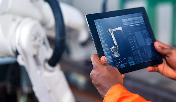
A successful prototype is a major milestone—but it’s not the finish line. This article unpacks why so many IoT products stall before production and what…
Many organizations invest in modern data tools—yet still face delays, silos, and inefficiencies. This article explores how to build a compelling business case for Microsoft…
Smart product development is more complex than it looks. From technical missteps to misaligned teams, we explore why most manufacturers struggle—and what the most successful…
Traditional data systems weren’t built for the scale and speed businesses need today. Learn how Microsoft Fabric is changing the game—by unifying analytics, governance, and…
Companies invest in custom software to solve problems, streamline operations, or gain a competitive edge—but too often, the final product falls short. Systems don’t integrate,…
Companies invest in custom software to solve problems, streamline operations, or gain a competitive edge—but too often, the final product falls short. Systems don’t integrate,…
Artificial Intelligence (AI) integration into custom software is no longer just an innovation; it’s a necessity for modern businesses. At Mutually Human, we specialize in…

